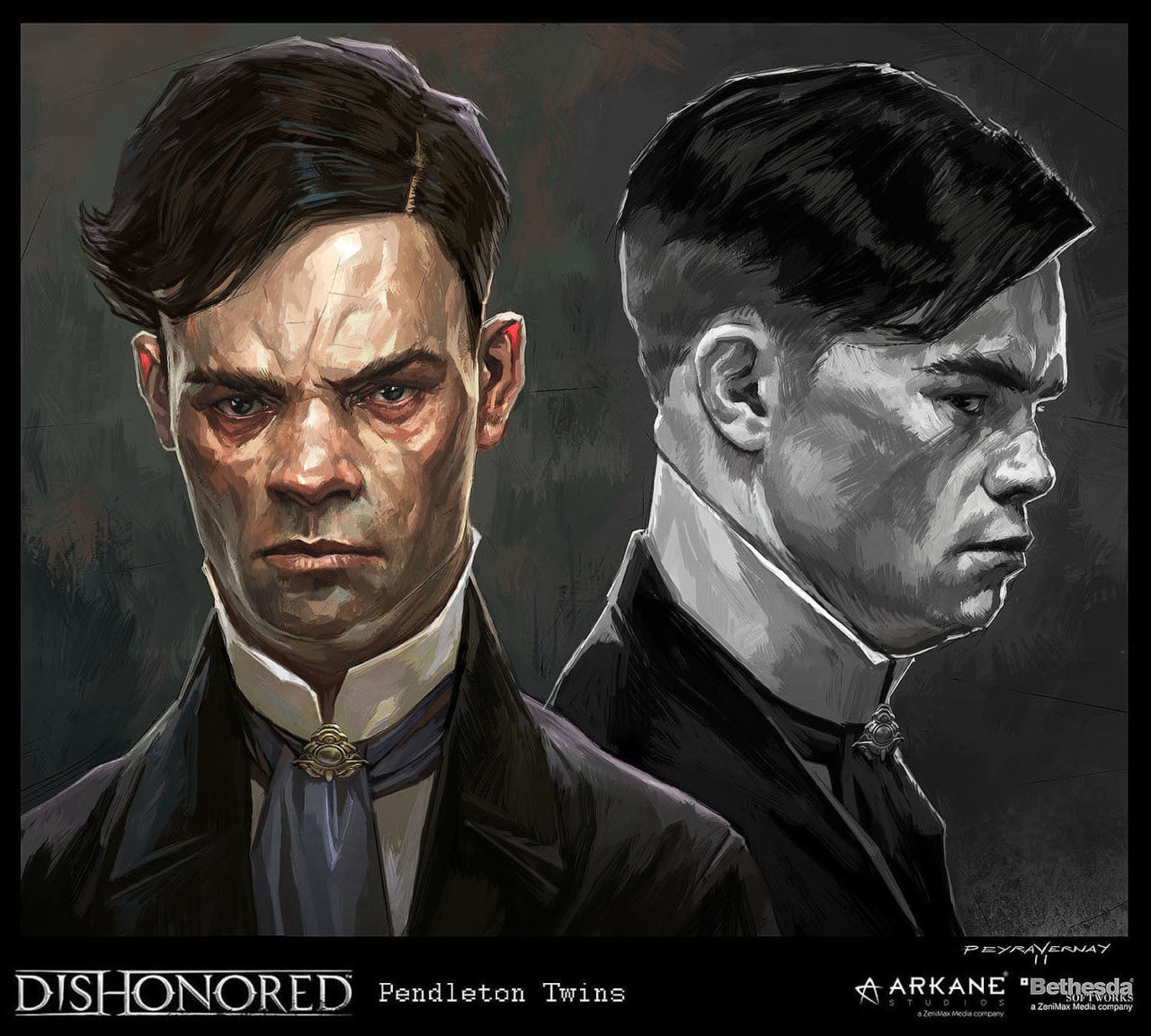
With Dishonored reaching its tenth anniversary this year – and Noclip releasing footage of Arkane’s scrapped Ravenholm game – I thought I could look at the art across the Dishonored games. The first article looked at Dishonored’s environments. This article will focus on the Dishonored’s characters.
Released in 2012, Dishonored is widely known and beloved for its distinctive art style. In both its environment and character design, the game features a stylised, exaggerated aesthetic.
British Faces
In the previous article, I talked about how the city is made up of sharp lines and blocky shapes and how that is used for visual storytelling. Well this visual language also continues in the character design. Anyone who has ever played Dishonored or seen anything about it, will surely recognise the sharp, scowling faces with exaggerated features.
Both Viktor Antonov, who was the game’s Visual Design Director, and Sebastian Mitton – the Art Director at Arkane – have spoken about how they visited London to get a sense of the city (see previous article). However, they also studied British faces, to try and understand what makes a face British. Frankly, if the Dishonored characters are what they’ve settled on, it’s pretty insulting.
In addition to modern day images, the art team at Arkane looked at photographs and illustrations from the Victorian and Edwardian eras. They looked at mugshots from Britain and Australia to get a sense of what type of character would fill the dark city of Dunwall. The art team were then able to use their own mugshots in-game, to help enrich the environment’s storytelling.
The Artistic Inspirations
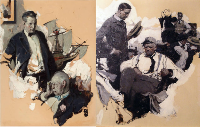
The artists the developers looked at included Dean Cornwell and Charles Dana Gibson. The developers of Dishonored liked Cornwell’s use of shape and line. In the two paintings above, you can see the same geometric style that the characters of Dishonored have. In the left painting, you can clearly see the use of brushstrokes and line to create expression. However, it is not fully realistic, Cornwell doesn’t mix the shades, but places them next to each other. This creates that blocky style, echoed in Dishonored. Also, note in the painting on the right how the man in the background resembles one of the Pendletons from Dishonored.
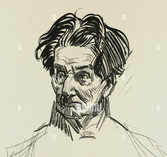
With Gibson’s illustrations, the developers at Arkane focused on his portrayal of the aristocracy. The team were particularly interested in his use of line. In the illustration above, look how Gibson’s use of quick, sharp lines completely defines the character’s personality with little detail. Look how the sharp lines, wavy hair and angular nose is repeated again and again in Dishonored’s characters.
Cedric Peyravernay
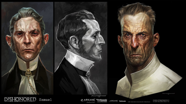
The most famous artist to be associated with the Dishonored game is surely concept artist, Cedric Peyravernay. The artist’s style is a match made in heaven for the style of Dishonored. So much so, in fact, that it would not be a surprise to learn that Peyravernay developed his famous style based on the research the team at Arkane did. In the paintings above, look how the use of line is similar to the angular lines of Gibson. Or how for the second game, Peyravernay’s concepts (on the right) took on the scratch-like hatching of Gibson.
In addition, the use of a bold, angular silhouette – accentuated by stark highlights – is similar to Cornwell and J.C. Leyendecker. The geometric brushwork is also reminiscent of Lucian Freud. Also note how the concepts look like mugshots with their turnarounds.
City and Characters Alike
By using the same visual language as the city’s design, the characters echo the same tone. They not only add a sense of cohesiveness to the world, feeling like they belong to the city. They also seem to illustrate the violence, danger and oppression that permeates the city. With their sharp edges, the characters of Dishonored feel dangerous or ruthless. Their patchwork-like skin echoes the blockiness of the city’s industry, but it also evokes that feeling of disease as the plague ravages Dunwall. The tall bodies and long faces reflect the verticality of the city’s architecture, but their furrowed brows and sharp noses echo the pointed rooves.
This sense of exaggerated line is consistent throughout the entire game. Hell, even the rats reflect the same characteristics. In fact, with their angry scowls the characters begin to look like rats. This not only reminds the players of the plague but also reflects the character’s dark, scheming personalities.
The art style is still incredibly effective after 10 years. The city and characters alike help to set the tone of the world and drive the story forward. Their exaggerated features and movements make the player feel slightly disorientated, echoing that off-kilter feeling in the story. They’re similar but something’s not quite right.
Sign up for our newsletter from the website.
Instagram: Go2GamesShop
Twitter: Go2Games
Youtube: Go2Games.com
Facebook: Go2Games.com
Store: Go2Games.com



One comment
Pingback: The Art of Dishonored: The Environments - Get2Gaming